As the 2018 midterm election approaches, politicians will be tempted to take credit or cast blame for how the economy is doing. There’s a huge partisan divide in economic confidence: probable Republican voters are much more likely to say they’re better off financially than a year ago than probable Democratic voters are. And even if candidates aren’t using the economy to score political points, people’s experiences in the labor market can affect how and whether they vote.
But, stripping away partisan posturing, how has the labor market really fared under President Trump compared with its performance under President Obama?
The labor market has done well under Trump. Yet, for the most part, these gains represent a continuation of the long recovery that began early in Obama’s first term. And the benefits have been well distributed—both red and blue America have shared in them.
Still, around the edges, some partisan differences do emerge: red states are now growing slightly faster than blue states, unlike in the Obama years. And two industries more concentrated in red America—mining and manufacturing—have rebounded notably under Trump. Yet these differences probably reflect longer-running trends or factors other than federal policy more than any actions the government has taken. It would be hard for politicians to credibly turn the labor market recovery into a partisan issue.
Employment and wage gains continue to be widely shared
In this post, we look at how people have fared in the labor market as we did last year. We divide the adult population into two groups based on our demographics-based model of who they were likely to have voted for in the 2016 election, regardless of whether they actually voted. For each group—which we’ll call likely Trump supporters and likely Clinton supporters—we calculated standard employment and wage measures using the same household survey data the BLS uses for its monthly jobs report.
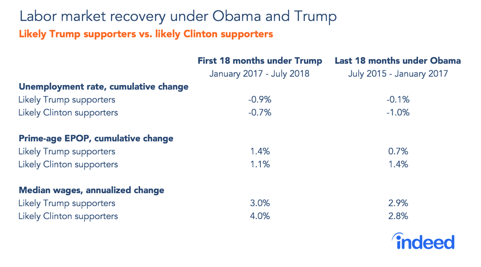
From January 2017 to July 2018, under Trump, the unemployment rate fell 0.9 points for likely Trump supporters and 0.7 points for likely Clinton supporters. For both groups, unemployment has been dropping pretty consistently since early 2010. In July 2018, the unemployment rate stood one percentage point higher for likely Clinton supporters than for likely Trump supporters, 4.1% versus 3.1%, a narrower gap than at the height of the recession. As with many labor market inequalities, the long recovery has narrowed these differences and has especially benefited the less-well-off.

There is a broader barometer of the labor market’s health that captures people entering or dropping out of the labor market: the prime-age employment-population (EPOP) ratio. Under Trump, prime-age EPOP has also improved in both red and blue America, rising 1.4 points for likely Trump supporters and 1.1 points for likely Clinton supporters. Like the unemployment rate, this measure has been improving for years for both groups. It has picked up later in the recovery than the unemployment rate as the tightening labor market pulls people who hadn’t been searching for jobs back into the labor force.
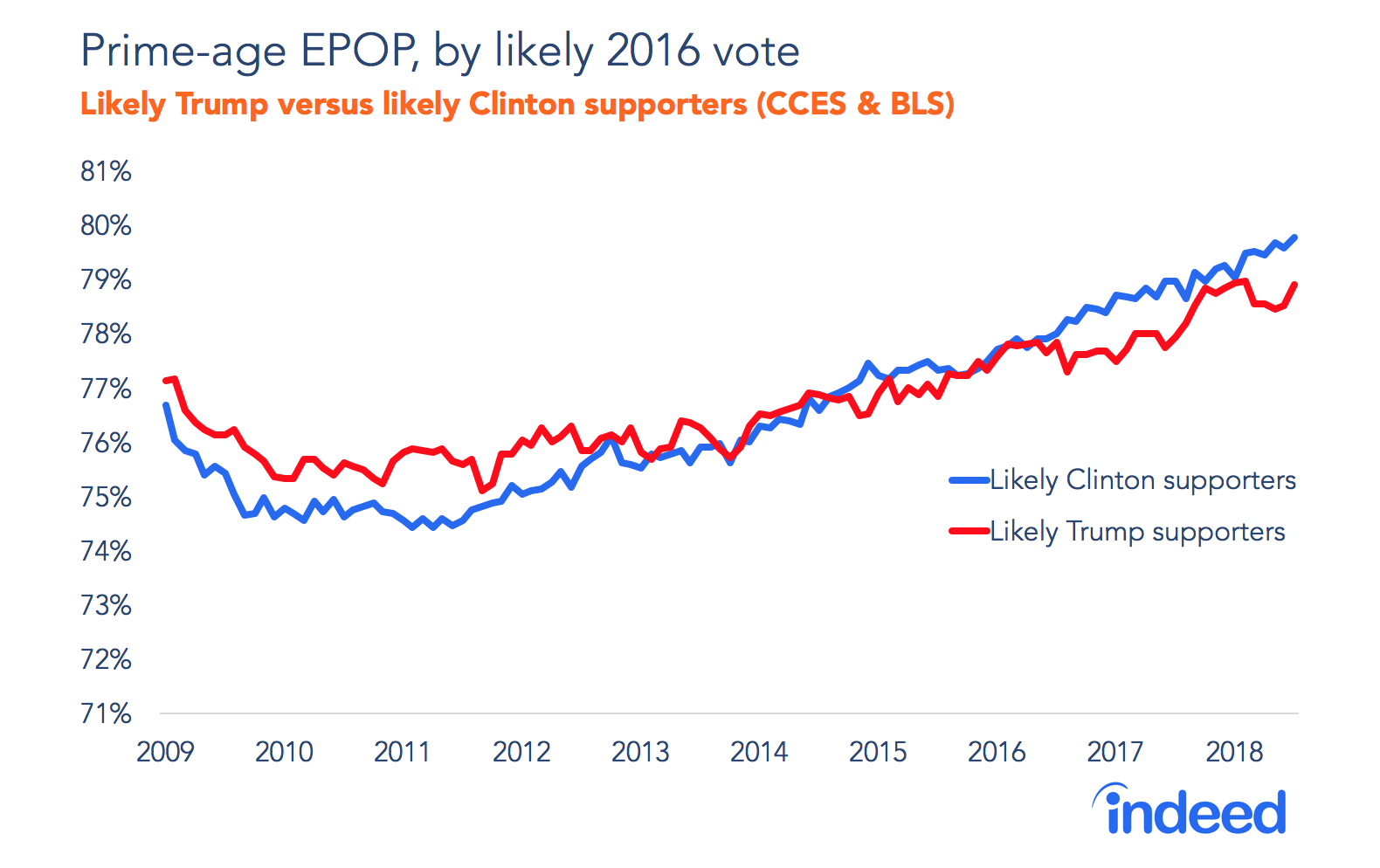
So far, this looks like continued, shared improvement. But squint harder at these charts and a subtle shift comes into focus. The pace of gains in both the unemployment rate and prime-age EPOP increased under Trump for likely Trump supporters, but slowed for likely Clinton supporters, as the table shows.
Is this evidence that Trump’s economic policies are disproportionately helping his base of non-Hispanic Whites without college degrees? Probably not. Rather, recent employment gains have gone to the least-educated—even more so since 2017 than before—because a tightening labor market helps the least well off. Among those without a college degree, both non-Hispanic Whites, who lean red, and Hispanics and non-Whites, who lean blue, have seen strong gains under Trump. But these employment measures have improved little in the past 18 months for college-educated adults, who tended to vote blue in 2016. Educational differences probably explain why improvements in employment have been greater for likely Trump supporters in the past 18 months.
However, these employment measures are volatile, based on a relatively small survey and rely on a far-from-perfect model of 2016 voting behavior. Plus, if anything, wage gains have gone in the opposite direction, rising a bit more for likely Clinton supporters than for likely Trump supporters. Let’s withhold judgment until we look at more data.
In job growth, red states and counties begin to accelerate
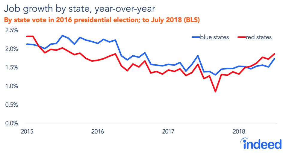
Like unemployment, job growth tends to rise or fall similarly in red and blue America. The broad path of job growth in the recession and recovery looks almost the same in red and blue states. But, as with unemployment and prime-age EPOP, there’s a hint of a faster rebound in red America under Trump: since March 2018, red states have had slightly better year-over-year job growth than blue states.
Of course, many states have red and blue parts: my state, California, has a deep blue coast and red parts inland. New York has blue Manhattan and upstate red regions. And many red states, like Texas and North Carolina, have blue big cities. Red and blue trends are clearer when we look at county data. These show job growth accelerated between 2016 and 2017 in counties that Trump won by at least 20 points.
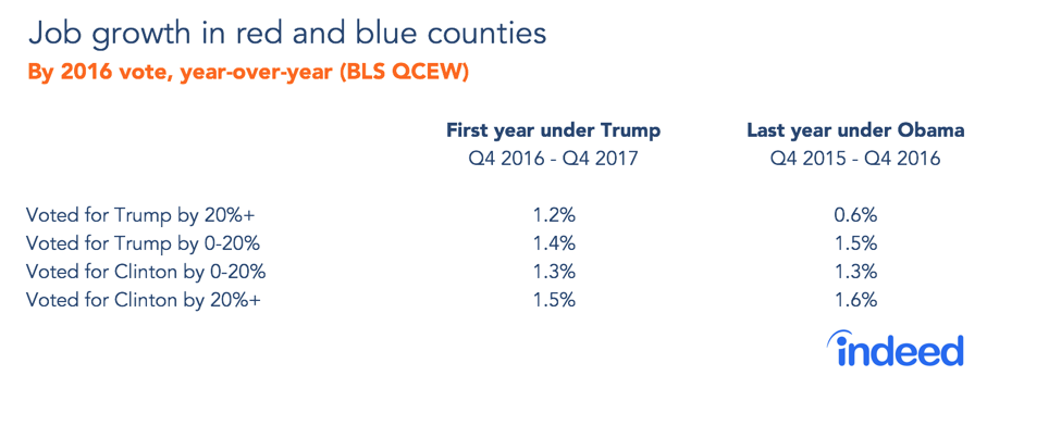
There’s a strong urban-suburban-rural partisan split in America. Deep red counties are almost all rural areas, small metros and outer suburbs of large metros. The deepest blue counties tend to be big cities and their dense inner suburbs. The acceleration of job growth in deep red counties reflects the broader suburbanization of jobs, a slowdown in growth in urban counties since 2015 and a slight pickup in rural counties in 2017. These patterns follow partisan lines but are probably driven by pre-existing deeper forces rather than recent policy actions.
Mining and manufacturing have rebounded
Industry sectors show the clearest evidence of labor market shifts. Under Trump, the fastest-growing sector has been mining and logging—a dramatic turnaround after big job losses in the last 18 months under Obama. Manufacturing has also rebounded, growing 2.0% annually under Trump after staying nearly flat in the last 18 Obama months. Both these sectors lean red in two senses: their employment is concentrated in red states and their workers tend to vote Republican.
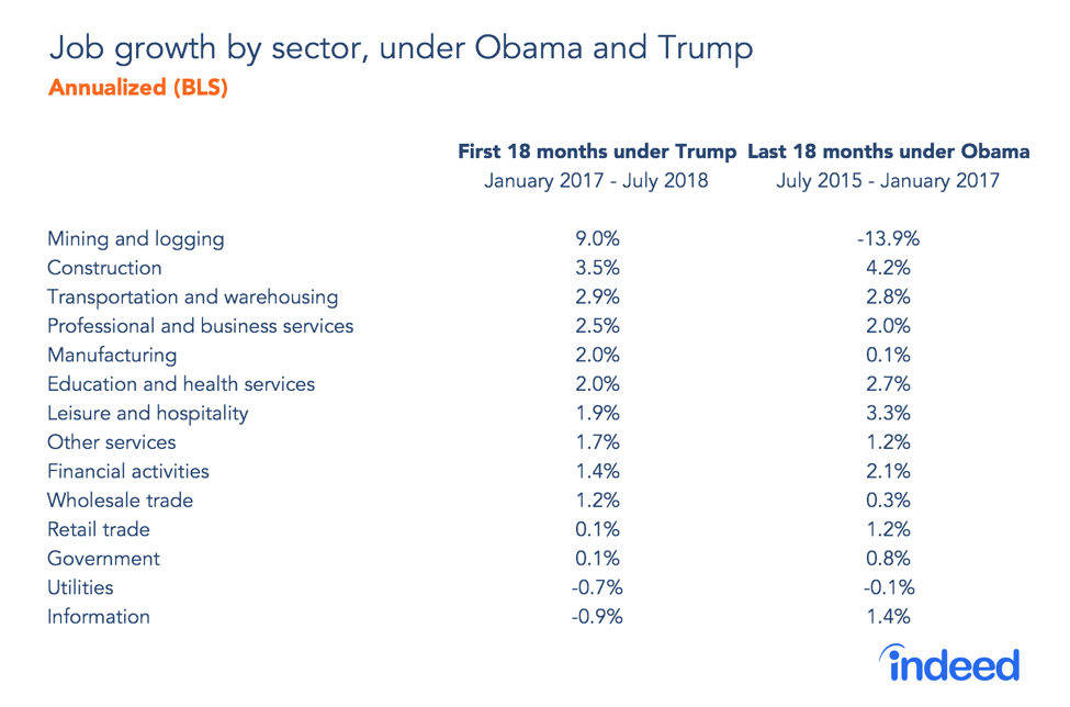
What caused these swings? Probably nothing either president did. The fall and rebound of mining employment track global oil prices closely. They plummeted in late 2015, bounced back and have been climbing since mid-2017. Manufacturing growth perhaps owes some thanks to strengthening global demand and a weakening dollar in 2017. However, there’s another possibility: the big increase in economic confidence among Republicans after the 2016 election may have lifted employment in redder places and economic sectors, though that’s hard to prove.
Still, these industry growth patterns show more continuity than change and aren’t clearly linked to politics. Setting aside mining, which is the most volatile sector and highly sensitive to global prices, the fastest-growing sectors under Trump and Obama are similar, with construction, transportation and warehousing, and several service sectors all expanding solidly.
Overall, as the midterms approach, the labor market continues to improve. People, places, and sectors on both sides of the partisan divide have benefitted, as they have throughout the long recovery. It’s worth watching whether the recent gains continue among likely Trump supporters in deep red counties, and in manufacturing and mining. These face headwinds. Trump’s push for higher tariffs could hurt manufacturing jobs more than it helps. Plus, job losses are projected to be a bigger long-term risk for manufacturing jobs and in deep-red counties than elsewhere.
Despite dramatic partisan swings in economic confidence, the labor market has improved steadily in red and blue America under both Trump and Obama. Midterm candidates looking for partisan battles will have to find those elsewhere — lucky for them, they’ve got plenty of other issues to choose from.
Methodology
To estimate unemployment, prime-age EPOP and wages, we used Current Population Survey microdata, followed Bureau of Labor Statistics definitions and made seasonal adjustments using the R package for X-13. People were classified as more likely to have voted for Clinton or Trump in the 2016 election based on their demographic characteristics using a model we built from the Cooperative Congressional Election Study. The methodology was first presented in an earlier post and is fully explained here. This post differs in one important way: rather than weighting CPS respondents by their voting-likelihood scores, we divided them into two groups based on which major candidate their demographics predict they would have been more likely to vote for.
Job growth for states and industry sectors comes from the BLS Current Employment Statistics. The latest available data are for July 2018. County-level job growth comes from the BLS Quarterly Census of Employment and Wages. The latest available data are for Q4 2017. Voting patterns for states and counties come from Dave Leip’s Atlas of U.S. Presidential Elections.
Correlation in job growth rates across 13 sectors, excluding mining and logging, between the Obama and Trump periods is high (0.67) and statistically significant at the 5% level.


